Exhibition Moodboards

Firstly, I wrote down my ideas of what I thought an exhibition would likely have;
- Online Advertisment
- Social Media
- Fixed layout (template)
- Commercial featured on TV
- Printed invitation (leaflet)
- Merchandise
- Brand Manual
- Facebook stories
- Instagram stories
- Good wayfinding system (online map)
- Fundraising events
- Feedback from audience
- Exhibition catalog (featuring the art pieces and descrption
- Comment Board.
Then I thought of different exhibition names;
- CMYK to RGB
- From sketch to reality
- In the mind of an artist
- Artist vs Designers
- Expect the Unexpected
- With a touch of colour
- Pantone
- Interlocked
- Think the unthinkable
- Colour Coded
- Senses
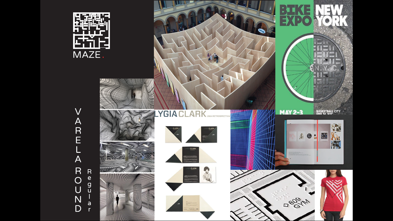
- Maze.
After, I decided to chose two exhibition names from the previous list and began sketching the logo and generating my ideas in more dept.
Colour coded;
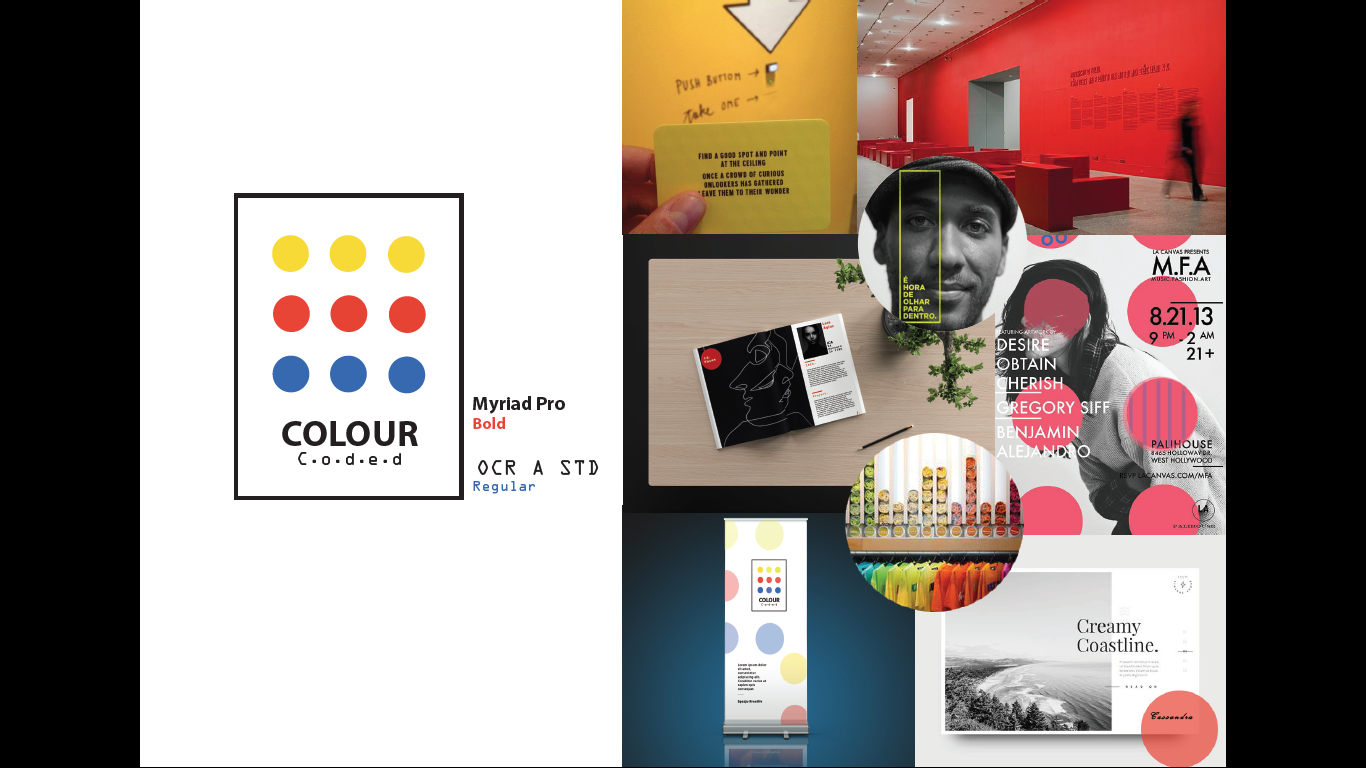
For the logo I decided to use the Mcast's logo colours which are yellow red and blue. Myriad Pro (bold) and OCR A STD (regular) was used for the logo's font style and font header and sub title.
- This exhibition idea was aimed to focus on each artis, giving them a chance to be recognized.
- A roll up banner was meant to be placed near the royal theatre in valletta to get more audience visit our exhibition.
- Merchandise is to be sold at the exhibition (tshirt, post cards with the artist signitures)
- A catalog is to be handed to each visitor at the entrance , each stand will have a number similar to the one in the catalog. In the catlog there will be the descriptions of every art piece or design and the message the artist wanted to give along with the artist details and portrait photo. This will allow the audience to take the catalog as a free souvenir and remember there experience at our exhibition when having this catolog with them.
- Rectangle like chairs will be placed in the centre of the exhibition rooms, this will allow the audience to sit and admire more the pieces in a comfortable position.
- Also, I thought of a challenge for the audience to make while visiting the exhibition. Cards with text will be placed, each card will hold a challenge which the visitor needs capture with a camera and share it on social media (free advertisment strategy )
- Rectangular stands are to be used for this exhibition.
Maze;
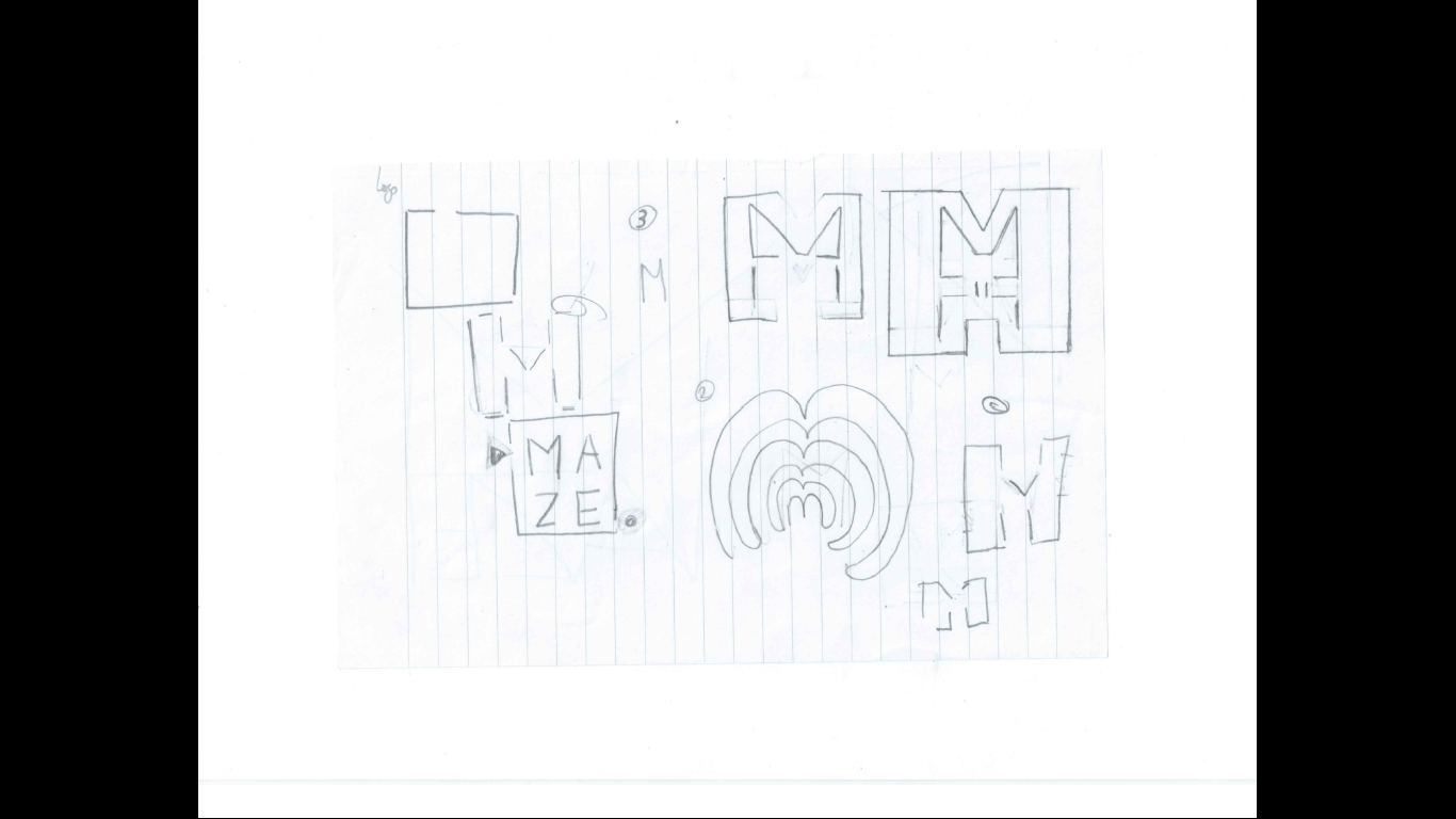
For the logo I dicided to create my own maze, the idea of the logo was meant to be scanned by using a mobile and it will direct you to the official ICA Festival Website. Varela Round (regular) was used as font.
- Merchandise
- Folded invitation (printed) to be sent to local people or companies
- Posters around valletta
- Each course would have its own booklet
- A maze like feeling when entering the exhibit areas
- line Illustration on some walls.