"Rotot"

"Rotot" is an exhibition that was held last year, it was revised by this years graphic design students in class. Every student pin pointed the advantages and disadvantages that the previous exhibtion showed or had while exhibting.
Everything that was said in class is written on this mind map below (fig.1).
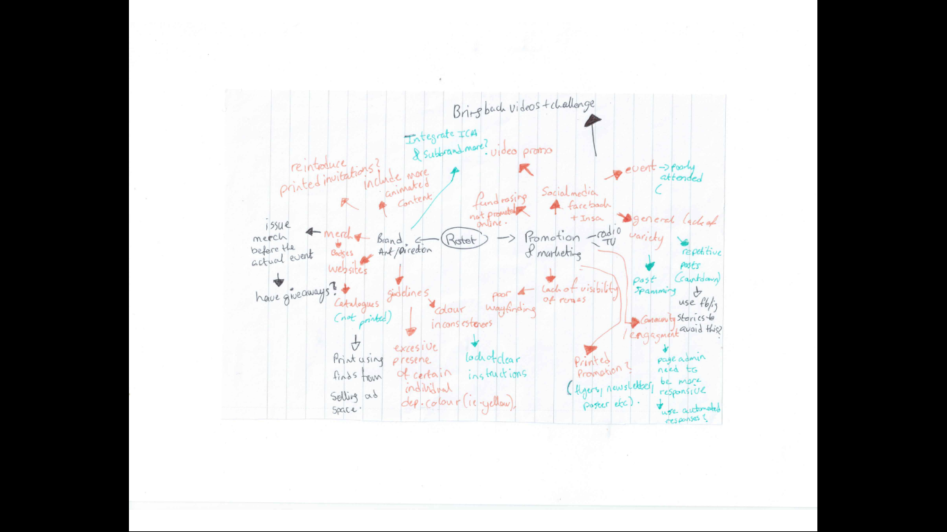 Fig.1
Fig.1
After, we had an individual exercise were we needed to research more about the good and bad from the "rotot" exhibition and write questions and facts about what we did not understand or think that went well. Some of these question were asked and mentioned in class and were answered by the lecturers.
Bad
- What is the meaning of the logo?
- Poor wayfinding system (map)
- Why did they use neon colours and a gradient background?
- What were the purpose of their footage or teasers?
- Why did they choose that location to film?
- People got really confused
- People could not find the exhibtion centre or location
- Not much was posted
- Was not intresting.
Good
- It got shared by various people on Facebook
- People knew about the exhibition because of social media
- Good description from the brand manual.